Georgian
 Chinese
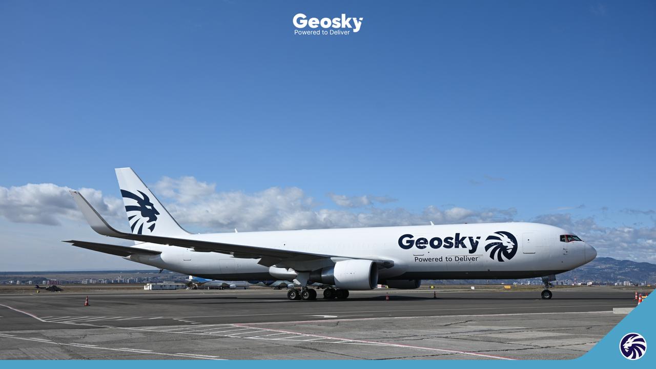
Geosky Airlines announces the successful completion of its rebranding process initiated in 2025. The project encompassed a comprehensive transformation of the company’s visual identity and the introduction of a new primary brand symbol — the Lion — established as the airline’s principal identifying mark.
2017 — From National Identity to International Ambition
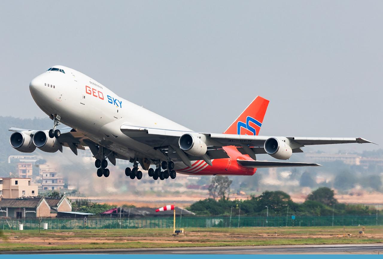
Founded in 2017, Geosky Airlines’ original visual identity reflected its Georgian heritage. The logo featured the outline of the map of Georgia, accompanied by the “Geo Sky” wordmark rendered in red and blue. The fleet livery was distinguished by a red vertical stabilizer bearing the “GS” abbreviation, which quickly became a recognizable brand element in international airspace — particularly on the Boeing 747-200F freighter aircraft that operated for many years across European and Asian routes.
The brand’s initial objective was to establish a corporate visual identity that preserved the red and blue color palette while modernizing its visual language in line with contemporary design and aviation industry standards.
2022 — Strategic Transformation
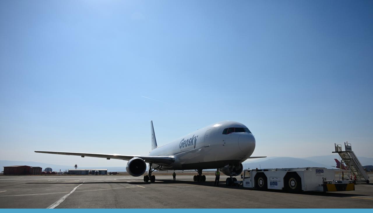
In 2022, the red color was fully removed from the brand guidelines and replaced with a refined indigo-blue tonality — a color associated with trust, professionalism, and technological maturity. The company name was consolidated into a single word — Geosky — underscoring brand unity and international positioning.
The updated logo architecture was built around a paper airplane motif integrated into the letter “Y.” This element conveyed lightness and upward motion, while its structured composition — defined by clean lines and precise angles — reflected Geosky’s operational accuracy and flexibility in partnership. The typography evolved into a bold yet elegant form with subtly rounded corners, reinforcing the brand’s accessibility and its human-centered business philosophy.
The earlier concept of an aircraft emerging from the letter “G” was reinterpreted through a new visual language emphasizing balance between form and negative space, incorporating dynamic shapes that communicate movement and forward momentum.
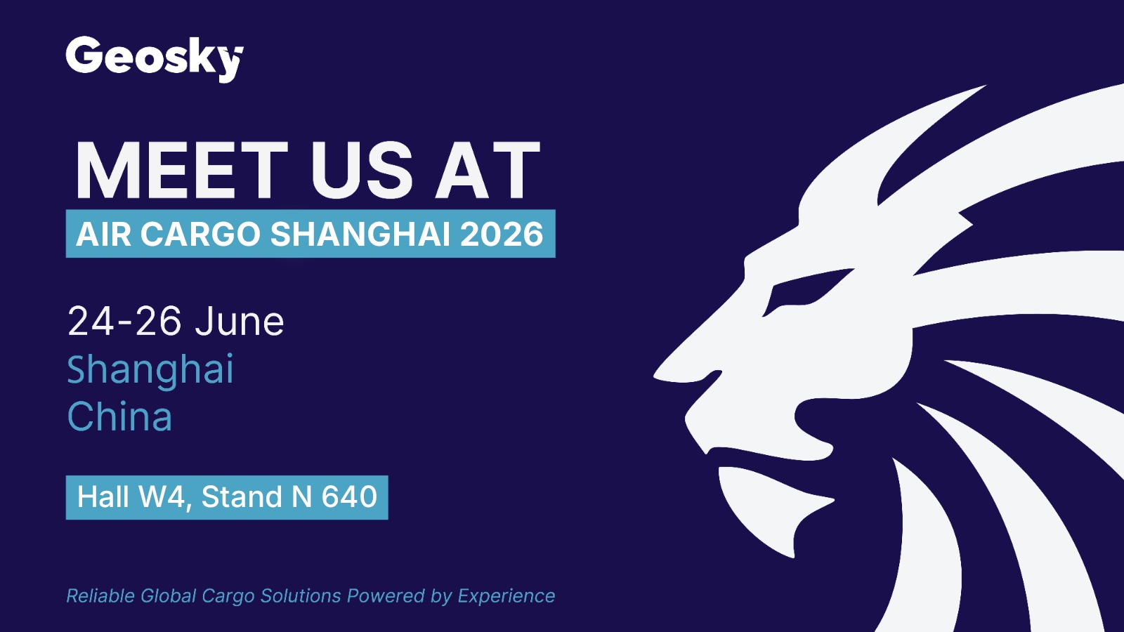
2026 — A New Symbol of Brand Identity
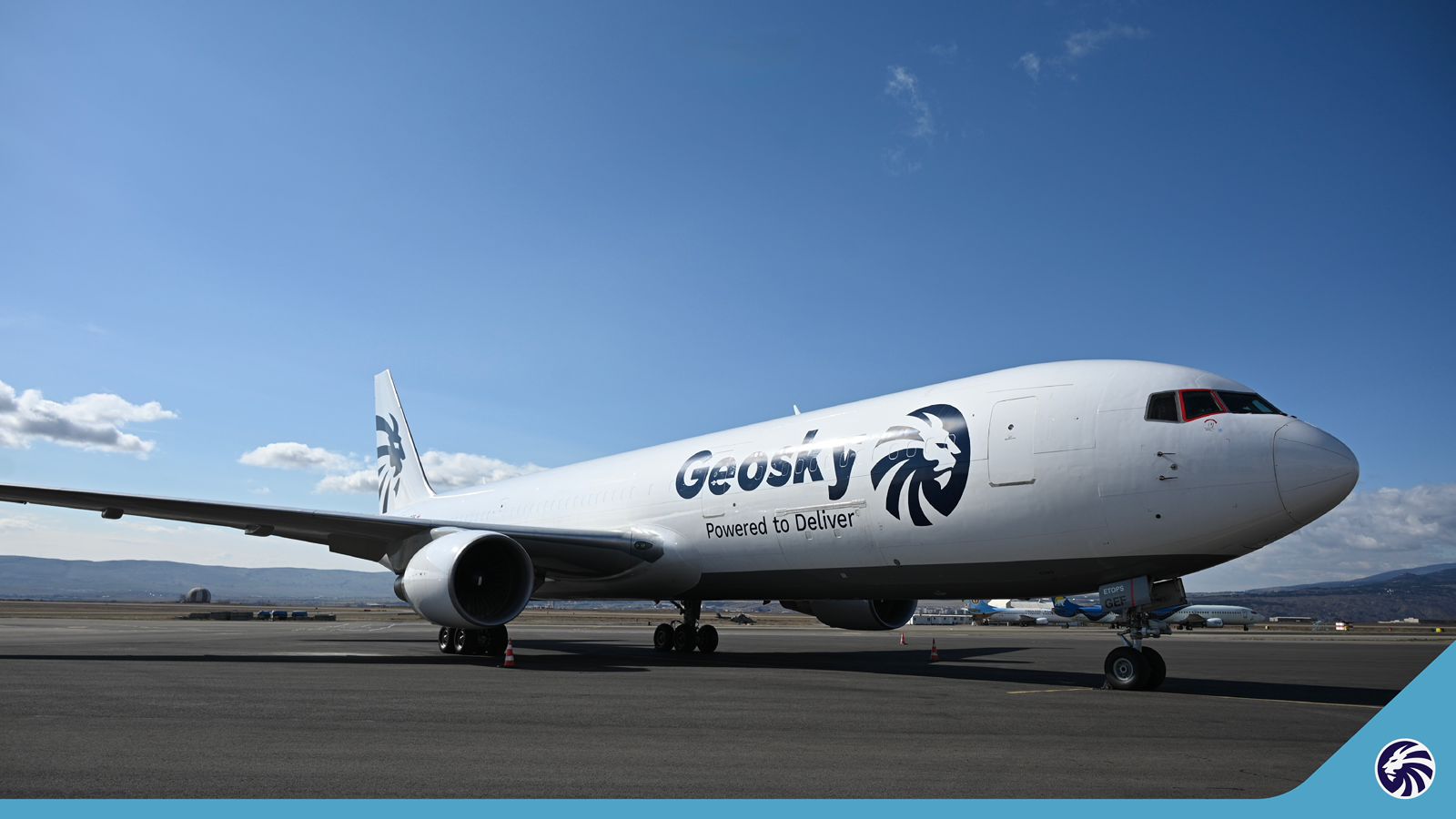
As the final phase of the rebranding process, in 2026 Geosky introduces a new core brand symbol — the Lion. The Lion embodies strength, safety, leadership, and strategic confidence.
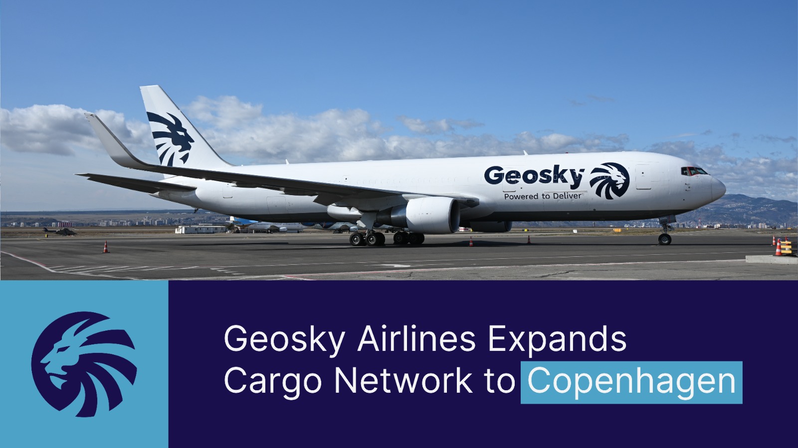
Its mane is inspired by the traditional Georgian Borjgali symbol — representing perpetual motion and continuous development. The dynamic lines of the mane visually echo the motion of a jet engine, symbolizing sustained energy, progress, and technological capability. The Lion symbol now enhances the corporate livery of Geosky Airlines’ aircraft, marking a new chapter in the airline’s evolution.
Beginning in March 2026, the Boeing 767-300F freighter aircraft in the fleet will operate under the fully updated branding — featuring a modern, minimalist, and instantly recognizable visual identity.
Geosky — Powered to Deliver
The rebranding represents more than a visual update. It is the natural progression of the airline’s development — energy in motion, strategic expansion, and responsibility toward every shipment, partner, and destination. “Powered to Deliver” encapsulates the philosophy of Geosky Airlines: energy, professionalism, and continuous advancement.
Geosky Airlines continues to operate in strict compliance with the highest safety standards, guided by the same principles that have underpinned its success since inception: reliability, operational precision, and sustained growth.